This comprehensive branding guide contains the guidelines for a visual communication system to be used throughout the Foundation. Follow these rules strictly to maintain brand consistency. This guide includes all of the elements you need including logos, typefaces, colors, and more. Following these guidelines will create a consistent tone, look, and feel for the Foundation and associated sub-brands.
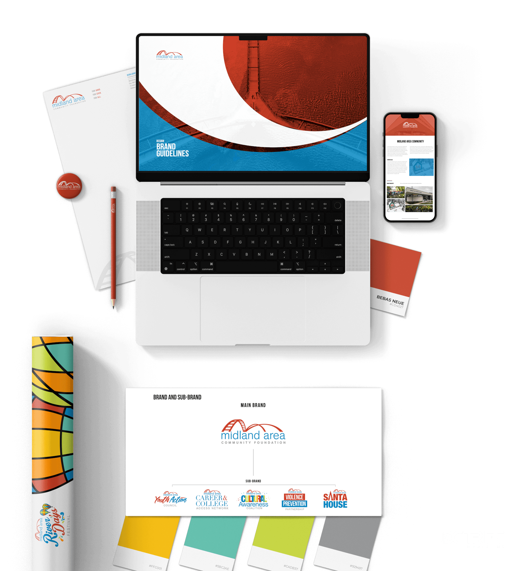
Midland area community foundation is a combination logo. It comes in two color combinations which make this logo simple, clean, and professional. There is only one variation of this logo, down below you can see the actual size of the logo design.

A clear space is defined to maintained the signature’s integrity. If the minimum clear space is not applied, the signature’s impact will be compromised. Do not allow any graphic elements, such as copy, photography or background patterns, to clutter up the clear space. The clear space is determined by the height of the logo symbol.Do not let other graphics or text violate this space.

It is important to maintain some basic rules when using the foundation’s logo. Here you will find alterations that are not acceptable and must be avoided. Proper usage of the logo ensures thorough maintenance and integrity of the brand.


Typography plays an important role in communicating an overall tone and quality. Careful use of typography reinforces our personality and ensures clarity and harmony in all of the communications.
To achieve proper readability across all mediums, there must be appropriate spacing for digital and print use cases. Line heights have been determined based on each style’s individual size and font weight.
Color plays an important role in the Foundation’s brand identity. The colors below are recommendations for future design projects. You will notice some of these secondary colors being used in the sub-brand logos. The use of the primary color scheme is a cornerstone of this brand and must be used across all digital and marketing materials. Secondary colors are supporting colors that will support primary colors in the mission to be both unique and unified.
Hex: #CD4027
Rgb: 205, 64, 39
Hex: #0089C6
Rgb: 0, 137, 198
Hex: #929497
Rgb: 146, 148, 151
Hex: #FFC001
Rgb: 255, 192, 1
Hex: #5BC2AE
Rgb: 91, 194, 74
Hex: #CADB37
Rgb: 202, 219, 55
Hex: #F0F0F0
Rgb: 240, 240, 240
Hex: #000000
Rgb: 000000
Midland Area Community Foundation
We firmly believe that the internet should be available and accessible to anyone, and are committed to providing a website that is accessible to the widest possible audience, regardless of circumstance and ability.
To fulfill this, we aim to adhere as strictly as possible to the World Wide Web Consortium’s (W3C) Web Content Accessibility Guidelines 2.1 (WCAG 2.1) at the AA level. These guidelines explain how to make web content accessible to people with a wide array of disabilities. Complying with those guidelines helps us ensure that the website is accessible to all people: blind people, people with motor impairments, visual impairment, cognitive disabilities, and more.
This website utilizes various technologies that are meant to make it as accessible as possible at all times. We utilize an accessibility interface that allows persons with specific disabilities to adjust the website’s UI (user interface) and design it to their personal needs.
Additionally, the website utilizes an AI-based application that runs in the background and optimizes its accessibility level constantly. This application remediates the website’s HTML, adapts Its functionality and behavior for screen-readers used by the blind users, and for keyboard functions used by individuals with motor impairments.
If you’ve found a malfunction or have ideas for improvement, we’ll be happy to hear from you. You can reach out to the website’s operators by using the following email
Our website implements the ARIA attributes (Accessible Rich Internet Applications) technique, alongside various different behavioral changes, to ensure blind users visiting with screen-readers are able to read, comprehend, and enjoy the website’s functions. As soon as a user with a screen-reader enters your site, they immediately receive a prompt to enter the Screen-Reader Profile so they can browse and operate your site effectively. Here’s how our website covers some of the most important screen-reader requirements, alongside console screenshots of code examples:
Screen-reader optimization: we run a background process that learns the website’s components from top to bottom, to ensure ongoing compliance even when updating the website. In this process, we provide screen-readers with meaningful data using the ARIA set of attributes. For example, we provide accurate form labels; descriptions for actionable icons (social media icons, search icons, cart icons, etc.); validation guidance for form inputs; element roles such as buttons, menus, modal dialogues (popups), and others. Additionally, the background process scans all the website’s images and provides an accurate and meaningful image-object-recognition-based description as an ALT (alternate text) tag for images that are not described. It will also extract texts that are embedded within the image, using an OCR (optical character recognition) technology. To turn on screen-reader adjustments at any time, users need only to press the Alt+1 keyboard combination. Screen-reader users also get automatic announcements to turn the Screen-reader mode on as soon as they enter the website.
These adjustments are compatible with all popular screen readers, including JAWS and NVDA.
Keyboard navigation optimization: The background process also adjusts the website’s HTML, and adds various behaviors using JavaScript code to make the website operable by the keyboard. This includes the ability to navigate the website using the Tab and Shift+Tab keys, operate dropdowns with the arrow keys, close them with Esc, trigger buttons and links using the Enter key, navigate between radio and checkbox elements using the arrow keys, and fill them in with the Spacebar or Enter key.Additionally, keyboard users will find quick-navigation and content-skip menus, available at any time by clicking Alt+1, or as the first elements of the site while navigating with the keyboard. The background process also handles triggered popups by moving the keyboard focus towards them as soon as they appear, and not allow the focus drift outside it.
Users can also use shortcuts such as “M” (menus), “H” (headings), “F” (forms), “B” (buttons), and “G” (graphics) to jump to specific elements.
We aim to support the widest array of browsers and assistive technologies as possible, so our users can choose the best fitting tools for them, with as few limitations as possible. Therefore, we have worked very hard to be able to support all major systems that comprise over 95% of the user market share including Google Chrome, Mozilla Firefox, Apple Safari, Opera and Microsoft Edge, JAWS and NVDA (screen readers).
Despite our very best efforts to allow anybody to adjust the website to their needs. There may still be pages or sections that are not fully accessible, are in the process of becoming accessible, or are lacking an adequate technological solution to make them accessible. Still, we are continually improving our accessibility, adding, updating and improving its options and features, and developing and adopting new technologies. All this is meant to reach the optimal level of accessibility, following technological advancements. For any assistance, please reach out to